
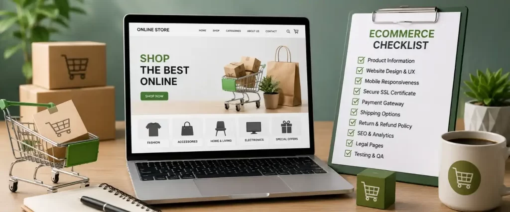
Ecommerce Website Checklist: What Every Online Store Needs Before Launch
Introduction
Launching an ecommerce website feels exciting right up until the point you realise how many small details actually go into making an online store work properly. It’s not just about uploading products and adding a buy button. A store that looks finished can still lose customers at checkout, confuse people with unclear product information, or simply load too slowly for anyone to bother waiting.
This checklist isn’t about covering every possible feature you could add. It’s about the things that genuinely affect whether someone completes a purchase or leaves halfway through. Whether you’re building your first store or fixing gaps in one that’s already live, this covers what actually needs attention before launch.
1. Product Pages That Actually Answer Questions
A product page has one job, to give someone enough information and confidence to buy without needing to ask you directly. That means clear, well written descriptions that explain what the product actually does, not just a list of specifications copied from a manufacturer’s sheet. It means multiple photos from different angles, and ideally a size chart, material details, or usage information depending on what you’re selling.
Pricing should be visible immediately, without requiring someone to add an item to their cart just to see the cost. Stock availability should be accurate, since nothing frustrates a customer more than going through checkout only to find out an item isn’t actually available. If a product has variations, colour, size, or type, switching between them should be simple and shouldn’t reload the entire page.
2. A Checkout Process That Doesn't Get in the Way
Checkout is where a lot of otherwise good stores lose customers. The general rule is to remove as much friction as possible. Every extra field, unnecessary account requirement, or confusing step increases the chance someone abandons their cart before finishing.
Offer a guest checkout option. Forcing account creation before someone can buy is one of the most common reasons people leave without completing a purchase. Keep the number of steps to a minimum, and make sure progress is clearly visible so customers know how much is left before they’re done. Auto fill and address suggestions help too, especially on mobile where typing full addresses is genuinely annoying.
3. Multiple, Clearly Explained Payment Options
Different customers prefer different payment methods, and limiting yourself to just one or two can cost you sales you never even see happening. At minimum, most stores need to support major cards, UPI, and at least one wallet or buy now pay later option depending on your market.
Whatever payment options you offer, make sure they’re clearly labelled with recognisable logos, since unfamiliar or unclear payment icons make people hesitate right at the final step. If there are any transaction fees or currency conversion charges, they should be visible before the final confirmation, not as a surprise after payment.
4. Shipping Information That's Upfront, Not Buried
Shipping costs and delivery timelines are one of the biggest reasons people abandon carts, especially when that information only shows up at the very last step of checkout. Make shipping costs and estimated delivery windows visible earlier in the process, ideally on the product page itself or at least before someone reaches the final payment screen.
If you offer free shipping above a certain amount, make that visible early too, since it often nudges people to add one more item rather than abandon the purchase entirely. Be realistic about delivery estimates rather than optimistic ones, since missed delivery promises create far more complaints than a slightly longer but accurate timeline.
5. Mobile Performance That Actually Works
A large share of online shopping now happens on phones, which means a store that works well on desktop but feels clunky on mobile is losing a meaningful chunk of potential sales. Buttons need to be easy to tap, text needs to be readable without zooming, and images shouldn’t take forever to load on a mobile connection.
Test the entire journey on an actual phone before launch, not just a resized browser window. Browsing, adding to cart, and completing checkout should all feel smooth without pinching, zooming, or accidentally tapping the wrong thing.
6. Trust Signals That Reassure First Time Buyers
If someone is buying from your store for the first time, they’re taking a small leap of faith, especially if your brand isn’t already well known. Trust signals help close that gap. Clear contact information, a visible returns and refund policy, and secure checkout indicators all reduce hesitation at the point of purchase.
If you have genuine customer reviews, display them, since social proof matters more in ecommerce than almost anywhere else online. Avoid fabricating reviews or ratings, since that damages trust far more than having a smaller number of honest ones.
7. Search and Filtering That Actually Helps
Once your store has more than a handful of products, browsing alone isn’t enough. Customers need a way to search and filter that actually narrows things down properly, by category, price range, size, or whatever attributes matter for what you sell. A search bar that returns irrelevant results, or filters that don’t actually filter correctly, pushes people to give up and leave rather than dig through pages of products manually.
8. Site Speed, Because Slow Stores Lose Sales
Every extra second a page takes to load increases the chance someone leaves before they even see what you’re selling. Large, unoptimised images are usually the biggest culprit on ecommerce sites specifically, since product photography tends to be image heavy by nature. Compressing images properly, along with clean underlying code, makes a noticeable difference in how fast pages actually load.
This also ties directly into SEO, since page speed affects how well your store ranks in search results, not just how customers experience it once they arrive.
9. Basic SEO Groundwork From the Start
An ecommerce store with no SEO groundwork is relying entirely on paid ads or existing brand recognition to bring in traffic, which is expensive and limiting long term. Product titles and descriptions should be written with actual search terms in mind, not just internal product naming conventions. Category pages need proper structure too, not just a dumped list of products with no organisation.
This is often where working with a proper website development company in Kullu or an SEO company in Kullu makes a real difference, since ecommerce SEO involves more moving parts than a standard business website, product schema, category structuring, and handling duplicate content across variations, to name a few.
10. A Plan for What Happens After Launchz
Launching the store is really just the starting point. Someone needs to keep an eye on broken links, out of stock items that are still showing as available, and payment gateway issues if they come up. Ongoing maintenance and small fixes matter just as much post launch as the initial build did.
If digital marketing services haven’t been planned for after launch, traffic tends to plateau quickly. A basic plan for social promotion, email follow ups for abandoned carts, and continued SEO work keeps the store from going quiet a few months after the initial excitement of launching wears off.
disclaimer
A good ecommerce website isn’t defined by how many features it has, it’s defined by how little friction stands between a visitor and a completed purchase. Product pages that answer questions, a checkout that doesn’t waste anyone’s time, honest shipping information, and a store that actually works properly on mobile cover most of what genuinely matters. Get those right before launch, and the rest becomes much easier to build on afterward.